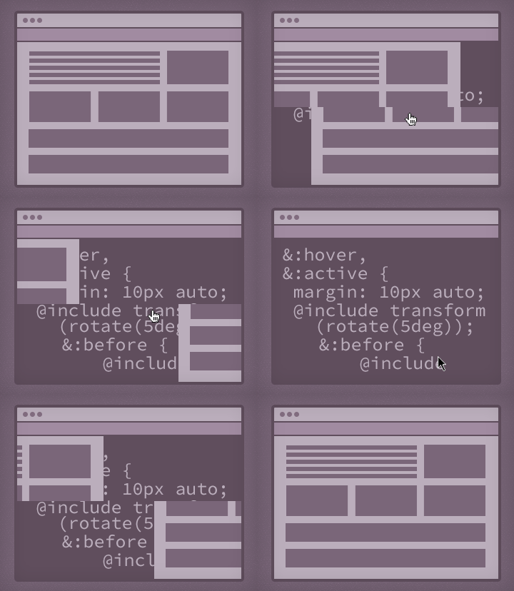
As a designer, my involvement in projects’ front-end development varies. Sometimes, I spend most of my time in code; other times, I work solely in Photoshop. But, there is one part of every front-end engagement that I always love to jump into the browser for: to create hover animations.
Hover animations are a site design element just like typography and color, so it’s important that designers take ownership of this step. Not only do hovers add to the look and feel of a site, but they also add an extra layer of usability for users with a mouse. A finished site may “work” without them, but these nuanced touches add polish and really reinforce a site’s personality. I like to think of their addition as “bonus design”—it’s an opportunity to better what’s being built.


