- October 30, 2015
Where we’re going, we don’t need roads…
Our work with SuperFriendly and Philly.com is well underway. We’ve shared some insights, and launched our work on a beta site starting with our templates for article pages.
 We’re receiving valuable feedback and some really positive initial reviews and reactions. I’m so proud of this work and its response, but I keep telling people “Just wait, there’s so much more on the way!”
In collaboration with the Philly.com product, design, editorial, production, and ad teams we started by building a site architecture through the core reading experience, starting with articles. In the new article template typography is roomy and readable, the ads are less intrusive, image attribution and sharing tools are easier to find without cluttering. And we’ve only just begun.
Designing for publishing experiences is a challenge. Designing through the intense publishing workflow constraints a newsroom imposes, as well as the business rules governing advertising, adds significant complexity. In order to concentrate our early design work we focused on information architecture, and less on graphic design in our initial release. We wanted to test hypotheses and focus on things like hierarchy, tabling some graphic design decisions until we had more information. Once those pages were launched however, and we’ve begun collecting insights, we wanted to dig deeper into graphic design and explore.
Enter the concept cars
Concept cars aren’t anything new. We selectively employ them at times. They’re design explorations that reach way into the future and develop potential future states. Something aspirational and unconstrained, unfettered by requirements that inform our immediate, implementable execution. But why daydream?

Our collaboration and relationship with Philly.com was primed for this kind of far-reaching thinking. We were ready to be challenged by ideas that might seem scary or risky. We met at the Philly.com offices and sketched out a dozen initial ideas on enough easel-sized poster boards to wallpaper an office.

We outlined potential business models and publishing strategies that ranged from concepts implementable in the next 6 months to borderline science fiction. We dug into them, prioritized a few we wanted to pursue, and got to work.

Designers made typography, color, and composition decisions based on the distinct hypothetical concepts they were charged to explore. Each created their own swim lane and developed single page compositions fleshing out their ideas.
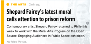
Within these explorations are exciting little details from utilizing the “dot” from Philly.com as wayfinding to color ranges that—warm my heart—remind me of the Spectrum. The Philly.com team was asked to respond to the three directions and boy did they. There was nowhere to hide from these ideas. Ambivalence wasn’t an option. A favorite emerged, elements of other ideas were appropriated, and the next step for our team is to apply some of that design thinking to our existing templates.
There are typographic decisions, color explorations, and layout ideas within these concepts that we’ll now incorporate as the next evolution of graphic design into the launched templates. The concept cars remain intact too. They’ll be the “Hang in there” cat posters above a designer’s desk as she builds new articles and sections of Philly.com. An aspiration that informs reality.
Unearthing the unexpected
Something else happened too. The Philly.com team started to take the beginnings of these ideas and breathe more life into them. Immediately one of our design ideas turned it into a new product idea. Something that could live alongside Philly.com, even as the same design thinking informed our redesign. The concept cars are driving our existing work. What’s just as exciting are all the surrounding ideas the concept cars provoked.
So if you like the new responsive article pages, keep your eyes peeled as we roll out more templates, and as we continue to build on graphic design.