
Design

Using type, color, space and symbols to communicate.

We’ve written 71 blog posts about Design. View all topics »

  1. Prototypical Process

    Rethinking Our Prototypical Process

    Headshot of Sophie Shepherd

    10/9/14

    by Sophie Shepherd

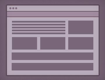
    When I started working at Happy Cog three years ago, deliverables fell neatly into two categories: design or code. In the design category, there was another clear division: UX design (wireframes) or graphic design (page comps). But then RWD came in and threw a spoke in the wheel. Since JPEGs only show a fraction of a responsive website, we needed to figure out new ways to communicate the design to move the project forward. We introduced HTML prototyping to replace traditional wireframes, and the lines between UX, graphic design, and front-end development blurred.

  2. Unlock

    Opening My Sketchbook to a Client

    Headshot of Jason Dziak

    10/2/14

    by Jason Dziak

    People who sketch well are intimidating. I’m talking about those who confidently visualize an idea with speed and style. Some are just born with this talent—others have to develop it. I fall into the latter category.

    Like many designers, I showed enough drawing ability to have put me on this career path but not enough to be an illustrator. That gap in drawing talent manifested itself as a lack of confidence with sketching, as well. I tend to see the vision as the pencil hits the paper—not before. As a result, throughout much of my career, I’ve kept my sketches to myself in volumes of Moleskins. I’ve rarely shared those doodles with coworkers and never with clients. The thumbnail-sized brainstorming and visual problem-solving made sense to me, but I had no confidence it could communicate clearly to others.

  3. Magpie

    The Magpie, the Peacock, and the Mole King

    Headshot of Michael Johnson

    9/25/14

    by Michael Johnson

    We lost another job to spec work.

    Originally I came here, to this previously blank page, horrifyingly white (both myself and the screen—it’s been a busy summer) and blinded by rage, to rail against designer injustices (the ones made for designers and by designers) and gnash my teeth and furiously hammer out another scathing anti-spec article (that no one needs), when I remembered a conversation.

  4. Typography 7

    7 Alternatives to Popular Web Typefaces for Better Performance

    Headshot of Katie Kovalcin

    9/4/14

    by Katie Kovalcin

    It’s no secret designers love typefaces. Web design is 95% typography, and it’s hailed as the most important aspect of a design. So, it’s imperative to find typefaces that accurately convey the voice of our words. Designers may not be always thinking about it, but how a site performs can be as important as choosing the right typeface. The weight of a font kit is arguably more important to a site’s performance versus other heavy hitters (like images), because fonts are loaded on every single page. And, after all, if a site loads too slowly, users won’t view the typography as you’ve intended!

  5. Presentingwconfidence

    Presenting Design with Confidence

    Headshot of Chris Cashdollar

    6/19/14

    by Chris Cashdollar

    When it comes to conducting a well-orchestrated design presentation, having prior presentation experience is a false measuring stick for success. Preparedness, not experience, actually breeds the confidence needed.

    “Are you ready?” Klaus asked finally.
    “No,” Sunny answered.
    “Me neither,” Violet said, “but if we wait until we’re ready we’ll be waiting for the rest of our lives, Let’s go.”
    – Lemony Snicket, The Ersatz Elevator

    Like Violet states, you can’t wait for the perfect moment or the deserving job title to feel comfortable presenting work to clients. To help nudge you out of the nest, I’ve culled these personal tips for anyone who has to stand up in front of an audience and talk about design fluently and with confidence.

  6. Performancebudget

    Designing with a (Performance) Budget

    Headshot of Katie Kovalcin

    5/29/14

    by Katie Kovalcin

    Lately, the web industry has been focusing on ways to improve performance—specifically, by applying the idea of a “performance budget.” A performance budget involves establishing a target page weight (usually in kilobytes), and then making sure no single page exceeds that value. While sticking to this number may seem like a developer’s burden to bear, as Mark Perkins puts it, “performance is everyone’s problem.” As a designer, it’s important to keep your budget in mind throughout your entire process—all the way from discovery through implementation. When both designers and developers work closely to set and stick to a budget, a sweet spot will emerge where neither performance or design will be compromised.

  7. Hover crafting

    Hover-crafting

    Headshot of Sophie Shepherd

    5/15/14

    by Sophie Shepherd

    As a designer, my involvement in projects’ front-end development varies. Sometimes, I spend most of my time in code; other times, I work solely in Photoshop. But, there is one part of every front-end engagement that I always love to jump into the browser for: to create hover animations.

    Hover animations are a site design element just like typography and color, so it’s important that designers take ownership of this step. Not only do hovers add to the look and feel of a site, but they also add an extra layer of usability for users with a mouse. A finished site may “work” without them, but these nuanced touches add polish and really reinforce a site’s personality. I like to think of their addition as “bonus design”—it’s an opportunity to better what’s being built.

  8. Devsshoulddesign

    Why Developers Need to Learn Design

    Headshot of Stephen Caver

    5/1/14

    by Stephen Caver

    A couple of years ago at Happy Cog, I transitioned from my position as a designer to a developer full-time. Up to that point, I had been a hybrid designer and developer, splitting my time between the two responsibilities. The truth is that it was a long-overdue transition. My passion lies in the development side of the spectrum, so I am glad to be in a role where I get to express that passion full-time.

    I no longer design all day every day, but my experience as a designer taught me that developers should learn and practice design. The trope is often that designers need to learn to write code, but in working as a developer on the web, I’ve learned that the value of a design education pays dividends beyond being able to mock up a page in Photoshop.

  9. Lookthesame

    And They All Look Just the Same

    Headshot of Greg Storey

    4/24/14

    by Greg Storey

    The article’s title is borrowed from Malvina Reynolds’ song, “Little Boxes.” No doubt, many of you have heard the lyrics, though sung by a different artist than the original songwriter. Malvina wrote the song to protest the mass conformity of home development taking place in a suburb of San Francisco in the early 1960s. If you have ever driven through the area, you can still see all the ticky-tacky, little boxes dotting the hillsides and throughout the area. Though Daly City provided the inspiration for the song, Suburbs of Sameness are prevalent throughout the country.

  10. Healthy website

    A Healthy and Balanced Website

    Headshot of Yesenia Perez-Cruz

    3/13/14

    by Yesenia Perez-Cruz

    Do you ever overcompensate? Maybe you’ve gone on an “unplugged vacation” to combat device addiction or embarked on a juice cleanse after an indulgent weekend. I’ve been there often.

    I’ll spare you the details of my “10-Day Sugar Detox,” but I can share a little about how I’ve overcompensated in my design work. You see, my early designs were chock-full of inconsistencies—every style I created had a unique embellishment. One day, I became fearful that I had become one of “those clueless designers” that frustrated developers write scathing articles about.